Nostalgia dominates the race for the Cinematography Oscar, with the Irishman, Joker, 1917, Once Upon a Time in Hollywood and The Lighthouse all nominated. Adrian Pennington takes a closer look at the nominees.
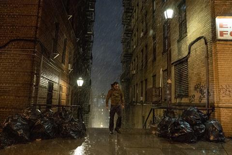
Period movies dominate the race. Joker and The Irishman repaint New York as a gritty early 1980’s Gotham and 1960/70s era Little Italy; Roger Deakins takes us back to the trenches of 1917 in Sam Mendes’ unblinking take on World War I; Robert Richardson’s 35mm film flashbacks to 1969 in Once Upon a Time in Hollywood, and the black-and-white 35mm film rendering of 1890s Gothic horror The Lighthouse is a tour de force for DP Jarin Blaschke.
The Irishman
Director of photography Rodrigo Prieto faced two challenges in translating Martin Scorsese’s organised crime opus to screen. He had to find a way of visually delineating the different decades of the story’s timespan and simultaneously grapple with the visual effects required to transform the appearance of the principal actors.
The latter consideration dictated the need to shoot about half the movie digitally for which Prieto needed to match the look with material shot on 35mm.
“One of the first things Scorsese and I talked about was memory and how we could portray that,” Prieto told IBC365. “He mentioned home movies so I started exploring amateur stills photography as a way to convey the passage of time.”
Research into different film stock resulted in emulations of the 1950s and 1960s Kodachrome as well as reviving a negative developing technique (for the 70s sequences) in which colour gradually drains from the picture to mirror the melancholy of protagonist Frank Sheeran’s life.
Prieto helped design a bespoke rig comprising two Alexa Minis on either side of a Red Helium camera to feed infra-red data into ILM’s VFX pipe.
“One of the privileges of a cinematographer is being right there a few feet from the energy of an actor giving their first performance,” Prieto reveals. “It’s more than a front-row seat in a theatre. You are participating in the moment. Everything – the costume, the production design, the virtuosity of the acting – is seen first through that lens and you are responsible for capturing it.”
The Mexican was Academy Award-nominated twice before, for Ang Lee’s Brokeback Mountain (2005) and Scorsese’s Silence in 2016.
- Read more: Behind the scenes: The Irishman
Once Upon a Time in Hollywood
Hollywood’s golden age collides with the rise of counter-culture in Quentin Tarantino’s story which is as much a paean to the lost world of LA as it is about events surrounding the Tate-LaBianca murders.
Robert Richardson, the director’s regular cinematographer (Oscar-nominated for Inglorious Basterds, Django Unchained and The Hateful Eight), delved into the era’s often obscure TV history to recreate a series of looks for the different elements of the story.
There are elements of Pulp Fiction and Kill Bill (also lensed by Richardson) as the picture essays through genres (Butch and Sundance to Texas Chainsaw and B-movie exploitation), and between fact and fiction mixed with pastiches of TV shows and commercials.
“I knew if [Tarantino] wanted a contemporary look for the series of commercials or whether to create a less slick feel,” he told IBC365. “The answer was different for the various commercials. One was to be black and white, another with a period feel, another more modern but not stunningly clean.”
For the Western TV series Lancer featuring Leonardo Di Caprio, Richardson attempted to create a blend of film and TV from that period.
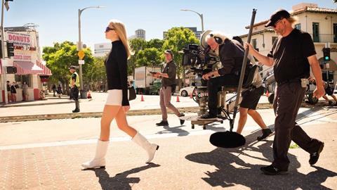
“I was hoping to have a smooth quality but with limitations visible. Quentin and I wanted a 70s’ retro feel, something not perfectly definable so that when watching the film, it feels off balance.”
He shot mostly in 35mm using anamorphic lenses to achieve high colour saturation.
“We’re pushing colours to places we do not ordinarily go to these days,” Richardson says. “A touch more grit and grain than we’re accustomed to. There’s a blend of past and present in the wardrobe, set design, hair and make-up which all greatly influenced the overall aim to look toward the past without sliding into cliché.
“I was given the final of the script a month or so after reading the previous pages at Quentin’s house. I went into a room at the office as the final pages were delivered. The door was shut - and I did not exit until I had finished the final act.”
Anyone who has sat through the final reel will feel the full force of this pay-off.
The Lighthouse
The Lighthouse is a salty sea yarn spun into an intense psychological horror by director Robert Eggers and cinematographer Jarin Blaschke (who both previously made The Witch) in startling black and white 35mm.
The time period itself is not stated though it would appear to sometime in the late 19th century, but the filmmakers succeed in spinning an apparently straightforward account of two lighthouse keepers (Willem Dafoe and Robert Pattinson) into a descent into madness that may be in the mind of one or other of the protagonists.
Set entirely in or around a lighthouse, Blaschke selects a square (5:6) aspect ratio to confine the vertical building and the characters inside.
Instead of shooting on colour and converted to black and white (as last year’s art favourite Roma was), Blaschke wanted to emulate the look of early silent movies and to emphasize the texture of his actor’s faces.
He shot on Kodak Double-X, a 60-year old film stock, with an original 1930s set of Bausch and Lomb Baltars lenses reworked to fit a Panaflex Millenium XL2 camera and with a custom made orthochromatic-emulating filter from Schneider.
This combination wasn’t particularly sensitive to light so required that Blaschke use about twenty times more light on the set in Nova Scotia to get the look they wanted.
“I actually wanted the Double-X to behave like an even older film stock, so a filter was made to prevent all red light from reaching the film,” Blaschke said. “This emulates pre-1930s orthochromatic film that couldn’t see orange or red light. Therefore, skies become much brighter and skin tones become darker and more rugged/textured. This was another critical element that makes the film feel more broken-down and distant.”
Joker
A character study rather than genre convention was the starting point for DoP Lawrence Sher’s and director Todd Phillips’ take on the DC Comics clown. They revisited movies like Serpico (1973) and Taxi Driver (1976) to produce a gritty visual aesthetic dripping with malice.
Sher shot scenes for the climactic Murray Franklin Show with seven cameras. “Alongside our A and B camera ARRI 65 bodies and the Alexa LF we had four Alexa Minis hidden inside prop cameras that represented the TV studio cameras so we could shoot the show just as we would if we were shooting the actual TV show,” he explains.
“We even had a TV director (Saturday Night Live director Don King) who would live cut the show in a booth behind the set using those four cameras as if he was calling a live tv show. Additionally, we also used old Betacam cameras for TV news footage and even VHS for the comedy club footage of Arthur performing.”
Using the Alexa 65 gave Sher a more narrow depth of field, isolating Arthur in his environment – an effect augmented by shooting in 1.85 to pen him in just a little more.
Joker is Sher’s first Oscar nod and sixth collaboration with Phillips following The Hangover series, Due Date and War Dogs.
- Read more: Behind the scenes: Joker
1917
If anyone can control the skies it is Roger Deakins. The British cinematographer is favourite to land his second Oscar after securing an unprecedented fifteenth Academy nomination for World War I drama 1917.
“The audience may not notice, but in the very last shot of the film we were trying to time the shot for the sun to come out of the cloud - and it did - just where I wanted it to,” he told IBC365. “For me, that was gold dust.”
Director Sam Mendes had conceived the idea of shooting as if in one continuous shot, but his script was conventionally written with no real clues as to how this would be achieved. It was down to Deakins and fellow heads of department including production designer Dennis Gassner and editor Lee Smith to proof the concept and then meticulously plan each shot to segue seamlessly to the next as far as possible before beginning principal photography.
“During rehearsal with the actors we finessed what we wanted to show and what we didn’t, and with Dennis, we mapped how the cameras would move through the sets,” Deakins says.
The camera is constantly moving as it tracks the soldier protagonists behind enemy lines and no location was used twice. An ARRI Trinity stabiliser, smaller than a traditional Steadicam, was employed for most of the picture and the film was the first to use the Alexa Mini LF, a lighter version of ARRI’s large-format camera which enabled Deakins to shoot with a longer lens while maintaining an epic quality to the frame.
Of the decision to choreograph as a single shot, he remarks: “For me, it was about not giving the audience a release from the violent and disorienting environment the characters are in. So, we don’t give them a wide shot, everything is from the character’s perspective, there’s no get-out clause.”
- Read more: Behind the scenes: 1917
Oscars 2020: A closer look at the VFX award nominees
- 1
- 2
 Currently reading
Oscars 2020: A closer look at the Cinematography award nominees
- 3
- 4








No comments yet