Marvel’s first scripted series blends its cinematic universe with retro sitcoms and a hint of Hot Fuzz.
Marvel’s Disney+ series owes as much to British action-comedy film Hot Fuzz as it does to yesteryear American sitcoms Bewitched and The Dick Van Dyke Show.
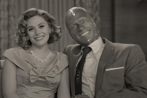
In Edgar Wright’s 2007 film, co-written by Simon Pegg, the cream teas and vicarage idyll of village England is shattered by murder and mayhem. Something sinister also lurks beneath the apple pie suburbia of Wandavision’s Westview. Creator Matt Shakman makes the connection explicit by inviting Hot Fuzz cinematographer Jess Hall to help design the look of the show.
“Matt Shakman is a Hot Fuzz fan and that was one of the reasons he thought about me for WandaVision,” says Hall. “In Hot Fuzz there’s sense of a neighbourhood and community but something uneasy going on under the surface. In WandaVision, we establish this bubble of a comfortable sitcom and then we fracture it. That’s a really interesting dramatic tension to work with as a cinematographer.”
Themed Week: Crafting Content IBC365’s content creation-focused week explores the many aspects of making great film and TV. Click here for more
The nine-episodes of WandaVision pay homage to several decades of American TV, starting in the 1950s and breaking through the fourth wall in the 2000s. Hall, a British DP who grew up with Porridge, Last of the Summer Wine and The Good Life, read up on the history of American sitcoms. He also studied classics like The Brady Bunch, Modern Family and Family Ties for clues about colour and visual vocabulary to translate into WandaVision.
“In WandaVision, we establish this bubble of a comfortable sitcom and then we fracture it. That’s a really interesting dramatic tension to work with as a cinematographer,” Jess Hall, cinematographer
“I wanted to understand what tools and techniques were used for specific shows and what was common to that era of TV,” he says. “The cameras and lighting instruments or film stock available to the show’s makers at the time influenced the creative choices they made.”
Hall could have chosen to shoot each episode using film and video cameras appropriate for each period but decided to use the Alexa LF for almost the entirety of production.
“I felt it was important to have some level of technical continuity because we are also varying aspect ratios, mixing black and white with colour and styles of composition often in the same episode,” says Hall. “Working with one camera platform was intended to provide a baseline on which we developed the colour science. I collected stills from different shows of the era, analysed the colour values and built a palette. These colour values could be translated across other departments, such as costume, so we could build a lot of coherence within the episode.”
With colour imaging guru Josh Pines at Technicolor, Hall created a LUT in 4K HDR for use as a style envelope for each period. To the colour science, he added 47 different lenses, some custom-made by Panavision for the show.
For example, he observed that as TV moved into the ’60s, the visual language became more cinematic. He had a pair of portrait lenses made for actress Elizabeth Olsen, for close-ups, which blurred the highlights at the edge of the frame.
I Love Lucy’s pioneering use of three cameras led to it becoming the standard technique for the production of most sitcoms filmed in front of an audience from the 1950s onwards. Consequently, WandaVision episode one was also shot in front of a studio audience and in two days to recreate the edgy vibe of live. The commitment to period extended to seating audience members on old school wooden chairs and asking them to come dressed in 1950’s wardrobe.
“Working with one camera platform was intended to provide a baseline on which we developed the colour science,” Jess Hall, cinematographer
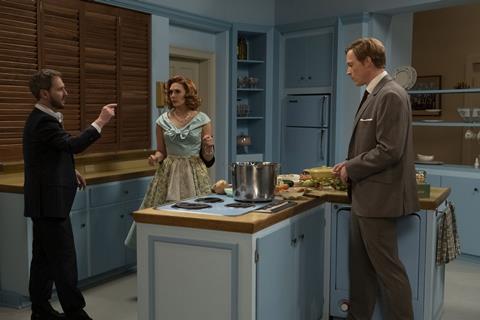
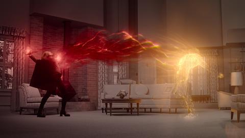
Episode two, ‘Don’t Touch That Dial’ mimics The Dick Van Dyke Show which ran 1961-1966, down to the living room layout and furniture. It was also shot single camera with more modelled lighting in contrast to the broader lighting scheme used in episode one.
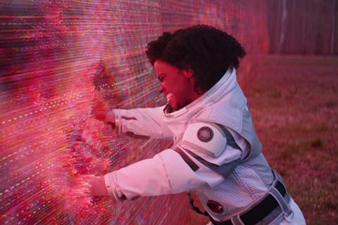
By the time Wanda has punched through the forcefield (called Hex) surrounding Westview into the Marvel Cinematic Universe (MCU) in episode three, the aspect ratio dramatically shifts from 1.33:1 (4:3) to the cinema screen ratio 2.39:1. The warm tones of the family sitcom are left behind for the cooler sheen of the MCU.
Hall rewatched key Marvel movies to ensure continuity between WandaVision and the MCU, particularly Avengers: Endgame and Avengers: Age of Ultron and scenes involving Elizabeth Olsen (Wanda) and Paul Bettany (Vision). For MCU world scenes he used the Panavision Ultra Panatars made originally for Avengers: Infinity War and Endgame. These anamorphic lenses were only used on the MCU’s S.W.O.R.D scenes, while spherical lenses were employed for everything in Westview.
“I was ‘encoding’ the Marvel world with a look that fans would be slightly familiar with, probably not consciously, but somewhere in their subconscious,” he says.
- Read more: Behind the Scenes: Love and Anarchy
Inspired by television’s visual language
Kevin Feige, the primary creator and producer of the MCU franchise, told the editing team he wanted the show to be era-specific but also readable by a modern audience. Editors Nona Khodai, Zene Baker and Tim Roche also reviewed DVDs of old sitcoms to get a handle on tone and pace but not quite to mimic the editing styles.
“The Dick Van Dyke Show was actually very fast in terms of the performances so we didn’t have to speed the editing up, but shows from the ’70s and ’80s are a little too slow for an audience today so we had to spend a bit more time quickening up those moments,” says Khodai.
Sound engineer Paul Iverson, who is credited as the show’s laugh track consultant, gave the team a selection of laughter track recordings from the live studio sitcoms of the ’50s and through the eras.
The editors also researched old TV commercials for toothpaste, soft drinks and watches to help recreate the style of the promos inserted throughout the episodes.
The biggest challenge editorially was the integration and interpretation of 2,500+ visual effects shots – more than in VFX extravaganza Endgame.
“In the script you’d get a line that would read Agatha absorbs power,” says Baker, who cut Thor Ragnarok. “On paper that seems easy – but translating that into visual storytelling can be tricky.”
The opening to episode eight, which centres when the series’ manipulative villain Agatha Harkness (Kathryn Hahn) is tied to a stake, proved a particular challenge for Khodai. “I didn’t know if it was going to turn out well. I didn’t quite have the coverage I needed, it was raining when they shot the scene and VFX-wise it was a challenge. It was hard to show that Agatha was absorbing the power – hard to make sure you could see what was happening. We worked it and worked it and now I’m super-happy with it.”
Multiple VFX shops including Digital Domain, Lola VFX, ILM, Rodeo FX, Zoic Studios and Framestore were marshalled by the show’s VFX supervisor, Tara DeMarco.
“We knew that the Hex had to be a boundary that kept the townspeople in, but was mysterious to the people on the outside,” DeMarco explains in Disney’s documentary special Assembled: The Making of WandaVision. “We decided early on that it would be more mysterious if it was an invisible Hex.”
She used “the language of television” as inspiration. “We studied how magnets were drawn on old CRTV televisions and the magnetisation you would get across the screen,” she says. “[We studied] the pixelisation you would get when you zoomed way into an old TV, those skinny lines that you would see on old NTSC square TV.”
The documentary also reveals that Bettany’s crimson face for Vision was actually blue in the black and white scenes, so that the colour would translate into a better shade of grey. It’s a technique actually used in the 1950s when actresses wore blue lipstick so it would appear ‘red’ on black and white telly.
















No comments yet