Transforming Wes Anderson’s idiosyncratic aesthetic into a visually consistent physical format presented a series of challenges for the film’s production designer and director of photography.
The singular visual style of Wes Anderson’s latest feature The French Dispatch looks more than ever like a live action animation. That’s not surprising given that he has made stop motion animations Fantastic Mr Fox and Isle of Dogs and perhaps decided to challenge himself to see if he couldn’t command such control over real locations and life-size sets, actors and practical effects.
It’s an experiment made in concert with the auteur’s regular troupe of actors and several behind the camera artists with shared histories on The Royal Tenenbaums, Moonrise Kingdom and The Grand Budapest Hotel.
Among them is production designer Adam Stockhausen, Oscar winner for ‘Budapest’ and whose talents are currently being put to use for Steven Spielberg on West Side Story and the next Indiana Jones project.
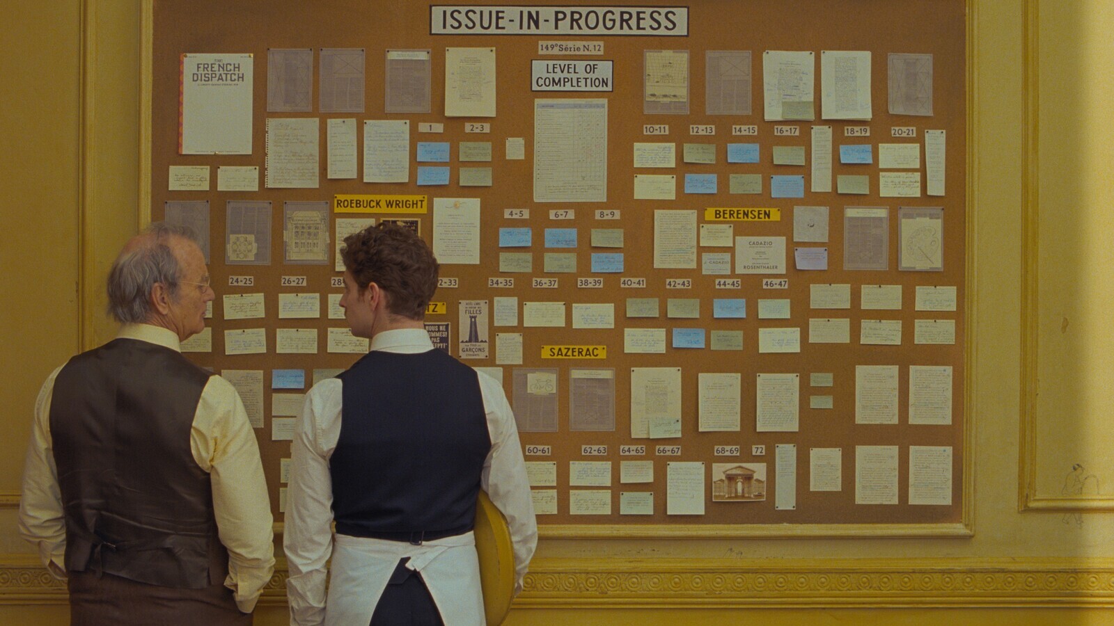
Stockhausen explains that all Anderson projects begin with an animatic. “The animatic is really a way of thinking through the entire movie from an animation point of view and building the entire film shot by shot in a way that defines the scope of what you see.
“We did the exact same process in Isle of Dogs but it’s applied differently here. In Dogs we would design for a table top miniature set. If it’s a wide shot we’re working in one scale and if it’s a close up we have another scale, but always in stop motion and in the context of a miniature set. In The French Dispatch, some of the live action is in miniature context, some is in context of the location and some are full-scale set builds.
“Conventionally you introduce a set and keep going back to it over and over again. Here, we introduce places and 20 minutes later we’re done with that story, never to return,” Adam Stockhausen, production designer
“The animatic certainly provides the blueprint but this one had so many different threads and stories and sets,” Stockhausen says. “I stopped counting at 125 different sets including miniatures. That’s way more than Budapest.”
Animatic blueprint
Robert Yeoman ASC, another Anderson regular, explains that he would set up each frame for the animatic using crew members as stand ins to block scenes. “I’ll address any lighting issues with Wes and Adam – are we lighting through the windows or relying on top light? What is the general feeling of the scene? This preparation makes for a more efficient shooting day when the actors arrive.”
The animatic is Stockhausen’s lead into thinking about how to fashion the sets. “I’m asking what kind of a space it is? What when you say ‘a hobby room in a prison’ what on earth does that mean? For the prison in The French Dispatch we might start with 10,000 images and whittle those down.”
This film was more complicated than normal given the magazine-like structure of The French Dispatch (full title The French Dispatch of the Liberty, Kansas Evening Sun). The comedy drama is inspired by Anderson’s love of The New Yorker and is about an American journalist based in France who sets out to create his own publication.
“The film is broken up into different stories each of which has its own visual story, so the task of design is multiplied,” Stockhausen says. There is even a pure animated sequence. “Conventionally you introduce a set and keep going back to it over and over again. Here, we introduce places and 20 minutes later we’re done with that story, never to return.”
The different episodes in the film take place within the fictional town of Ennui-sur-Blasé. “Mission number one was to find the city,” says Stockhausen. “There is a grandness of scope to the way we introduce the city which you can really only get from being somewhere and specifically in France.”
Finding the location
Tonal references included The Red Balloon, a 1956 French fantasy short filmed in the Ménilmontant neighbourhood of Paris, and photos of Paris before its reconstruction in the mid-19th century.
“The idea was to find a town which felt like Paris but not as it is today – more a sort of memory of Paris, the Paris of Jacques Tati,” explains Stockhausen.
- Read more: Behind the Scenes: In the Heights
The search began on Google Earth, from which a shortlist was photographed by location scout. This was narrowed down to half a dozen cities which Anderson and Stockhausen toured by car.
“We were looking for a place with the right combination of streets and also somewhere where vertical space is important,” Stockhausen says. “The old photos of Paris showed twists and turns, ramps and stairways as well as a two-dimensional grid. There are hills that run through a part of Paris where you’ll see a street which then suddenly becomes a staircase and then becomes a street again, and then it intersects with another street at an angle and then that one goes in a tunnel underneath the staircase of the first one.
“The architecture of the city has this incredible maze-like complexity to it. The trick was to find an actual city where we could get that feeling in a tight geographical area.”
They found such a place in Angoulême in southwest France. Outside of town, the production turned a derelict felt factory into a make-shift movie studio with a prop store, carpentry mill, sculpture room, set dressing and three stages.
The last piece of the location puzzle was the prison. “That location had to carry a huge chunk of the story,” Stockhausen says.
Inspiration came from Orson Welles’ 1962 film The Trial which had staged interiors at Paris’ Gare d’Orsay. “In Welles’ film the sets were built inside the station and you can kind of see off the edges of the sets and the architecture of the station beyond it. That was a driving image for the prison set. We found this empty facility that had the right sort of shell to build the prison. It had great windows and a great concrete balcony which we don’t try and hide. We just built our cellblock rows, craft room and execution chamber into it.”
“It’s the sense of a beautifully grimy city, really murky stuff on all of the architecture, and then these glorious colours come popping out,” Robert Yeoman ASC
Other key visual or thematic texts for the film included French film classics Vivre Sa Vie, Diabolique, Quai Des Orfèvres and Les Quatre Cents Coups.
Colour, aspect ratio, static tableaux
The French Dispatch is shot on 35mm with Yeoman finding the texture of negative film more in keeping with the story’s artisanal aesthetic. Several sequences are shot in black and white with colour used for emphasis, for instance when actress Saoirse Ronan leans forward to reveal her blue eyes.
“It’s the sense of a beautifully grimy city, really murky stuff on all of the architecture, and then these glorious colours come popping out, just the way the balloon does in The Red Balloon,” Yeoman says. “So, amid our gritty town, you’ll see this luminous yellow café or these jelly bean-coloured cars.”
To design costumes and sets that would work in both monochrome and colour they shot tests to help determine how it would look on screen. Explains Yeoman: “Does a yellow shirt look white in black and white? Does a dark blue look almost black?”
A further design complication is Anderson’s desire to move the camera on a dolly to connect different elements of a scene without fading to black or making a cut.
For one scene this entailed hanging the entire façade of le Café le Sans Blague from the ceiling of the felt factory so it could just slide away on a rail.
In ‘The Private Dining Room’ sequence of the film, the camera moves from room to room in the kidnapper’s lair, introducing all of the criminals in one shot to give a sense of the space and their connection to each other.
The first establishing shot of The French Dispatch building uses a real location in the town to which production added two buildings on either side of the camera.
“We had to add those to actually make the composition what we wanted because we couldn’t find just the right thing,” Yeoman says. “And we had to do it in mid-air. Because Wes didn’t want to be tilted up on the French Dispatch building but to be looking straight at it, the camera had to be up in the air on top of a ladder.”
The trickiest job was a section of ‘frozen’ tableau of still life sets which the camera tracks across but was unlike anything Stockhausen had attempted before.
“Because we had the animatic, we knew exactly where we were going, but the translation of that into a physical thing just wasn’t simple. Using paintings of forced perspective means you don’t even know what the lens is or where the camera is going to be or how these ‘frozen’ people relate to it. Basically, how do you develop your vanishing point?”
They worked through the problem by building maquettes and models before moving up to full-scale canvas sheets as backdrop with members of the crew posing in place while Yeoman and Stockhausen adjusted the perspective.
“It was really a sort of a three-dimensional sculptural process of figuring out where to place the actors and props and how you could use the space,” Stockhausen says. “Once we’d done that for a single panel we then had to think about what happens as we travel through space to the next one. How do the palm trees and sphinxes overlap with the column of the wrought iron palace?
- Read more: Behind the Scenes: WandaVision
It was amazingly complicated and it was a total work in progress. We marked it out on the floor week after week and gradually developed to a point where Wes told us to just put the dolly track down. We were doing last minute adjustments as the camera was switched on.”
He continues: “We’ve done shots like that before but always with three dimensional sets with walls that come out towards the camera more, just as we do in the introduction to the police station in The French Dispatch. The walls help you delineate the different spaces but with forced perspective 2D painting we had none of those crutches to help us.”
Supervising art director Stéphane Cressend found a group of scenic painters employed at the Paris Opera to create the backdrop paintings for this sequence and others in the film.
“We showed them the physical set and asked them to paint a backdrop and then they very quickly did this really gorgeous sort of trompe l’oeil painting,” Stockhausen says. “It was really fun for me because that’s how I started out my career – as a painter of backdrops and maquettes for an opera company.”
Anderson also uses different aspect ratios to tell parts of this story. It’s a technique he has used before, notably on ‘Budapest’ when Yeoman shot 1:37 for the scenes that take place with concierge Gustave to signify the time period of the 1930s and 1940s.
“We loved the compositional possibilities that this aspect gave us and so carried this over to The French Dispatch,” Yeoman says. “Occasionally we would change to a wider ratio for emphasis, just as we did using colour.”
An example is the scene in which we see a first glimpse of art works exhibited in the prison. “It’s the night of the show and everyone is eagerly waiting in the dark,” explains Yeoman. “When the lights come on, the frame changes to an anamorphic widescreen in colour and we see all of the paintings in frame. This could never have been accomplished in the much squarer frame of 1:37. The use of colour adds to the impact of the shot.”
Editorial manipulation
Many shots underwent minute editorial manipulation such as re-speeds and split screens, the handywork of editor Andrew Weisblum.
“We’re doing all kinds of internal surgery on a static shot to change the timing between the different characters,” he says. “One shot which shows everybody waking up in the village had 12 different split screens in it to make everything line up. There’s probably 20 of those types of little manipulated tableaus in the movie but every time you see a shot with two people there’s generally a split screen there.”
Angoulême, co-incidentally, is home to a significant number of France’s animation and video game studios and its annual animation festival briefly halted the film’s production.
“It was amazing working in France because every single person in the crew was so interested in the movie we were making. I never had the feeling anyone was just there punching a clock,” Stockhausen says. “On a Wes Anderson picture there is this incredible push for the first round of sets before you get a few moments rest before scrambling to get ahead the next round so the animation festival came in the nick of time!
No comments yet